
Can Wall Colors Improve Navigation for Low Vision?
When her eyesight began to fade, she thought the world itself was dimming. Shadows merged into each other, corners blurred, and hallways that once felt familiar became uncertain. One afternoon she mistook an open doorway for a solid wall and reached out into air. “It was only a few inches off,” she said, “but it felt like the whole house had changed.”
Her family responded with love and caution, rearranging furniture and adding lights. But what surprised them most was the difference made by paint. When they repainted one wall in a deeper color, she began to move with confidence again. “I can tell where the room ends now,” she said. “I can feel it with my eyes.”
That sentence captures something profound. Color is not decoration alone. For people living with low vision, it can become a guide, a quiet companion that defines safety and orientation. Wall colors can turn confusion into clarity, allowing people to navigate their homes through contrast and tone rather than sight alone.
The Science of Seeing Without Seeing
Vision is more than brightness. It is contrast, texture, and depth. When those begin to fade, the brain relies on subtle differences in tone to map space. A person with low vision might not see edges clearly, but they can perceive changes in light and color that indicate where one surface ends and another begins.
An occupational therapist once explained, “People with reduced vision do not need more light. They need better light and clearer contrast.” The same principle applies to color. A room painted entirely in pale shades can feel like a fog. Walls, doors, and floors blend into each other, erasing the natural cues that help people stay oriented.
Color reintroduces edges. It outlines the rhythm of a room.
Why Neutral Can Be Confusing
Neutral tones are popular because they feel calm and timeless. Yet, for people with low vision, neutral-on-neutral interiors can be disorienting. Beige walls beside cream trim or light gray doors against similar flooring may appear as one continuous surface.
A woman with macular degeneration described her hallway as “a tunnel with no end.” She said, “I used to feel like I was walking through air, waiting to bump into something.” When her son painted the baseboards in a darker shade, she immediately noticed the difference. “Now the walls feel solid again,” she said.
Color, used thoughtfully, can restore boundaries that the eye no longer defines.
The Role of Contrast
Contrast creates clarity. A dark wall beside a light doorframe, or a light ceiling above darker walls, gives the brain clear markers of direction and distance. For people with low vision, these contrasts act like silent signposts.
One designer shared that she always paints door frames at least two shades lighter or darker than the wall. “It makes a doorway feel like a doorway again,” she said. The difference does not need to be dramatic. Even subtle variation can offer enough distinction to guide safe movement.
Color contrast is not about style. It is about communication between the space and the senses.
The Psychology of Warm and Cool
Beyond visibility, color carries emotion. Warm tones such as soft terracotta or muted gold can feel comforting and inviting. Cool tones like blue and green tend to calm the mind and help with focus.
A family caring for their father, who had low vision, chose gentle contrasts in warm colors for his living area. “He said it felt like sunlight,” his daughter shared. In the hallway, they used cooler shades to signal transition. “He could tell which room he was in just by the feeling of the color.”
Color does not need to speak loudly to be heard. It only needs to whisper clearly enough to be felt.
Natural Light and Paint Interaction
The way color behaves depends on light. A wall that appears soft yellow in daylight might look white under artificial bulbs. For people with low vision, such shifts can cause disorientation, especially when moving between rooms.
A contractor who worked with visually impaired homeowners said, “We test colors at morning, noon, and night before painting. The same wall can change character throughout the day.”
Matte finishes often perform better than glossy ones because they reduce glare and reflection. Smooth, flat surfaces absorb light evenly, allowing true contrast to show without confusion.
Design begins with observation. The room itself tells you how it wishes to be seen.
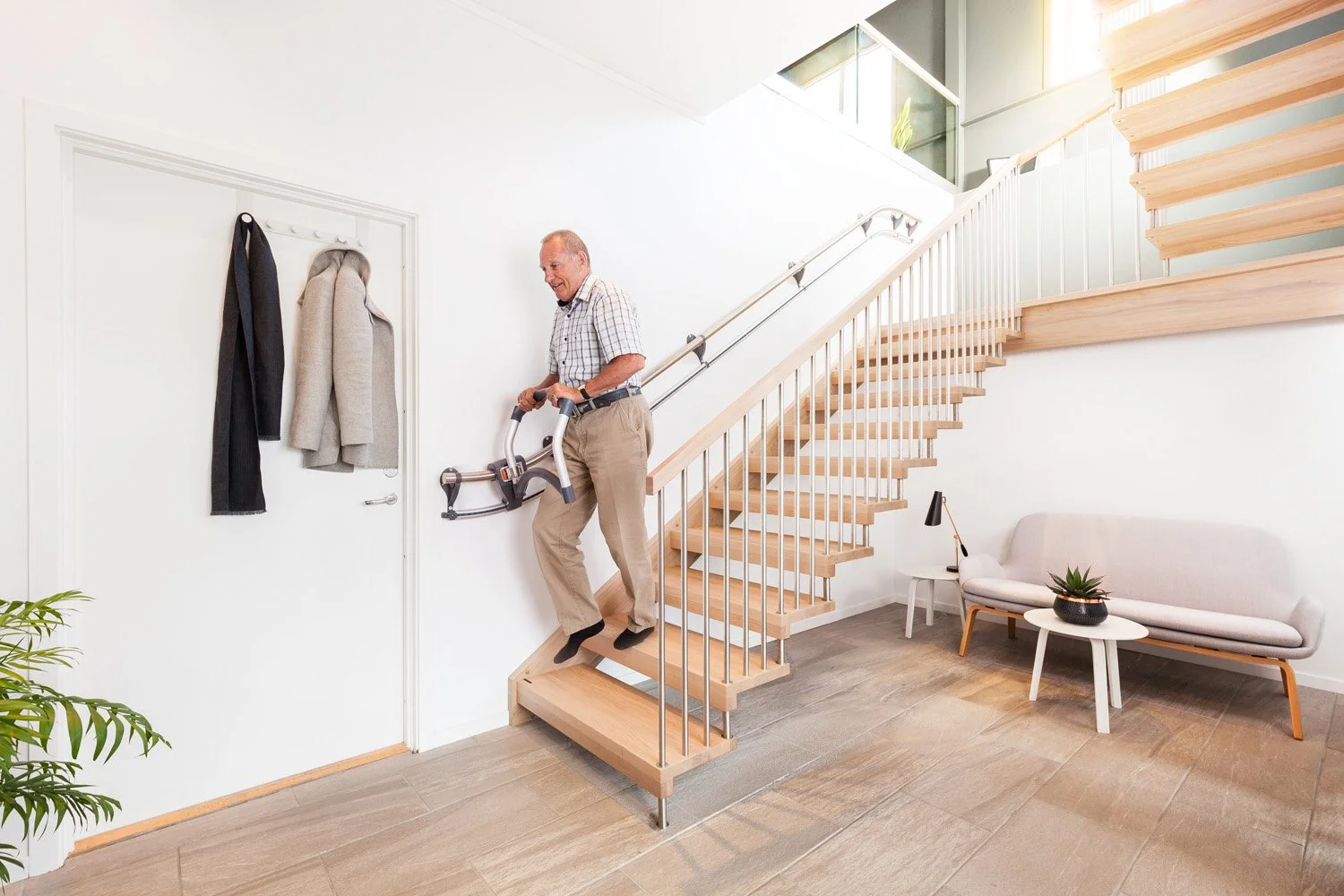
Doorways, Corners, and Clarity
Doorways and corners define movement. When they blend into surrounding walls, orientation disappears. A person with low vision might approach a hallway and see only one continuous shade of color, making it hard to know where to turn.
A homeowner once described her frustration with a white-on-white interior. “I never knew where the hall ended and the living room began,” she said. After repainting the connecting walls in soft taupe with cream trim, she said, “It is like the house came back into focus.”
Designers often use deeper tones at transition points, such as staircases or hallway ends, to signal direction and depth. The brain perceives darker colors as closeness and lighter ones as openness, creating subtle orientation cues without words.
The Role of Flooring and Furniture
Color guidance works best when it includes coordination between walls, floors, and furniture. A dark wall beside a similarly dark floor offers no boundary to someone with limited vision. By contrast, pairing light walls with a darker baseboard or flooring helps define edges.
A man who used a white cane said, “When the floor and wall are too close in color, my cane feels lost.” His designer changed the floor stain to a medium oak against light gray walls. “Now I know exactly where I am,” he said.
Accessibility begins at the intersection of surfaces.
How Color Directs Flow
Color can act as a navigational map. A continuous color scheme in open spaces creates calm, while shifts in tone can mark transitions. For example, using a lighter hue in living areas and a slightly darker one in hallways helps distinguish routes.
A woman who lived alone said she learned to “read” her home through color. “I know the kitchen by the yellow walls, the hallway by the green, and the bedroom by the blue. It is how I memorize space.”
This method, sometimes called color zoning, gives intuitive structure to a home without signage or barriers. It allows people to navigate by mood and memory.
Avoiding Overstimulation
While contrast aids visibility, too much variation can overwhelm. Bright or saturated hues may create visual noise that confuses rather than clarifies. For those with certain visual impairments, intense patterns can distort perception.
An interior specialist explained, “The trick is balance. Too little contrast hides boundaries; too much contrast hides comfort.” She recommended layering soft contrasts that remain clear but gentle, allowing the eyes to rest while still defining space.
Good design never shouts. It speaks in measured tones that comfort and guide.
The Role of Lighting in Color Perception
Color and lighting are inseparable partners. Even the most carefully chosen palette can lose function under poor illumination. Shadows can darken corners and distort tone, while uneven lighting creates patchy visibility.
An accessibility consultant once compared lighting to punctuation. “It tells the brain where one thought ends and another begins,” he said. Layered lighting — ceiling, wall, and floor — ensures that color cues remain readable at every level.
When light and color work together, the home becomes both navigable and nurturing.
Emotional Safety in Familiar Tones
For many individuals with low vision, familiarity is key. Sudden color changes or high contrast in unexpected places can startle. Using consistent tones throughout main routes helps build comfort. Accent walls can then serve as visual anchors in key areas.
A woman said she always felt disoriented entering her friend’s house because every room was painted in bold, different colors. “It felt like walking through a kaleidoscope,” she said. In her own home, she chose consistent earthy tones and described the effect as “peaceful memory.”
Emotional safety is as vital as physical safety. A well-chosen color scheme provides both.
The Influence of Age and Perception
As people age, their eyes naturally perceive color differently. Blues may appear faded, reds more intense, and whites slightly yellowed. Designers who understand these shifts can choose palettes that remain visible and pleasant under changing perception.
A retired teacher said, “I used to love soft blues, but now I cannot tell them apart from gray.” Her designer replaced them with warm beige and green tones that she described as “comfort I can still see.”
Design should grow with the person, adapting to how the world looks through their eyes, not ours.
Incorporating Texture with Color
Texture enhances the power of color by adding tactile reinforcement. Rough surfaces catch light differently than smooth ones, providing both visual and physical cues. Combining texture and tone ensures that even subtle changes register as transitions.
A designer used textured wallpaper along one hallway wall for her client with low vision. “She said she runs her hand along it as she walks,” the designer shared. “It helps her know where she is.”
Accessibility that involves touch as well as sight turns homes into multi-sensory environments.
Exterior Applications of Color
Navigation does not stop at the front door. Exterior wall colors, porch railings, and door frames all influence how safely a person with low vision can approach a home. A dark entryway against a light façade can feel hidden, while balanced contrast provides orientation.
A man said, “I used to have trouble finding the front steps at night.” His family painted the trim in bright white and added warm lights under the eaves. “Now it feels like the house is smiling,” he said.
Exterior color choices are the first invitation a home offers.
Collaboration Between Experts and Families
Effective color design for low vision benefits from collaboration among designers, occupational therapists, and families. Professionals bring technical knowledge of pigment, light reflection, and accessibility standards. Families bring lived experience — the rhythm of daily life that reveals where design truly matters.
A therapist recalled a project where the homeowner’s daughter noticed her mother hesitating at the hallway’s end. “It turned out the wall and door were the same color,” she said. A simple coat of contrasting paint solved a problem years of habit had hidden.
Empathy remains the strongest design tool of all.
Learning from Commercial Spaces
Public buildings such as hospitals and airports often use color zoning and contrast to aid navigation. Brightly colored lines on floors or contrasting wall bands guide movement without signage. Homes can adapt these ideas subtly, maintaining elegance while improving orientation.
A woman who volunteered at a senior center noticed that its pale green walls with white trim felt clearer to her mother than her own beige home. “It gave me ideas,” she said. “Now my hallway looks like theirs, and my mom moves confidently again.”
Accessibility design borrows from everywhere, translating large-scale solutions into intimate spaces.
Beyond the Paintbrush: Living with Color
The best color design does not announce itself. It lives quietly within the home, serving both beauty and safety. Over time, it becomes invisible again — not because it fades, but because it works so naturally that the person forgets it was ever needed.
A homeowner with low vision said, “After we repainted, I stopped thinking about it. I just live here again.” That is the goal of every accessibility effort: to make the home feel effortless.
When color restores ease, it restores dignity.
Conclusion
Color is more than decoration. It is guidance, memory, and comfort woven into the very structure of a home. For people living with low vision, thoughtful color contrast and design bring clarity where shadows once lived. They create spaces that feel both beautiful and secure, where movement is steady and the world once again feels welcoming.
At KGC, we believe that design should never separate safety from beauty. Our team helps families and individuals craft environments that honor how people see, move, and feel. Through careful color selection, lighting, and layout, we turn homes into places of freedom and warmth.
If walls and hallways feel uncertain or unclear, a fresh coat of color might be more powerful than you imagine.
Contact KGC today to discover how thoughtful color design can make every corner of your home brighter, safer, and easier to navigate.